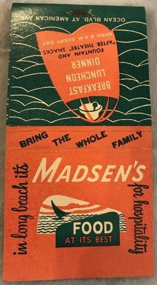
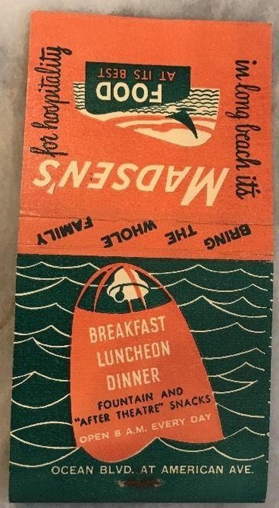
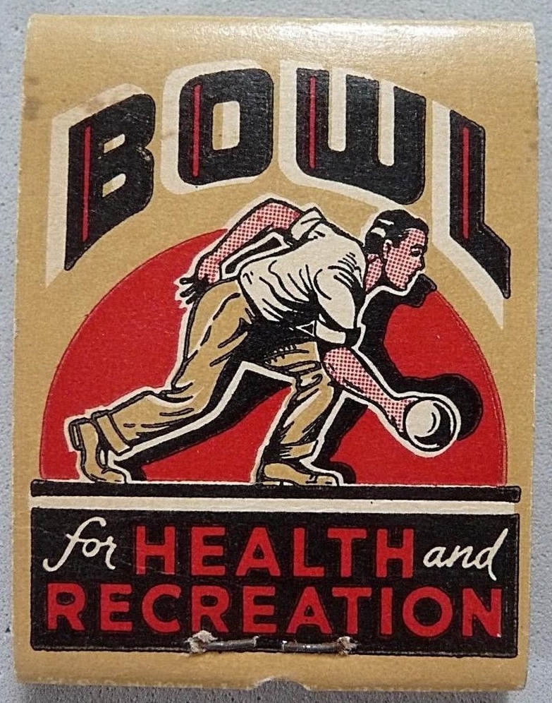
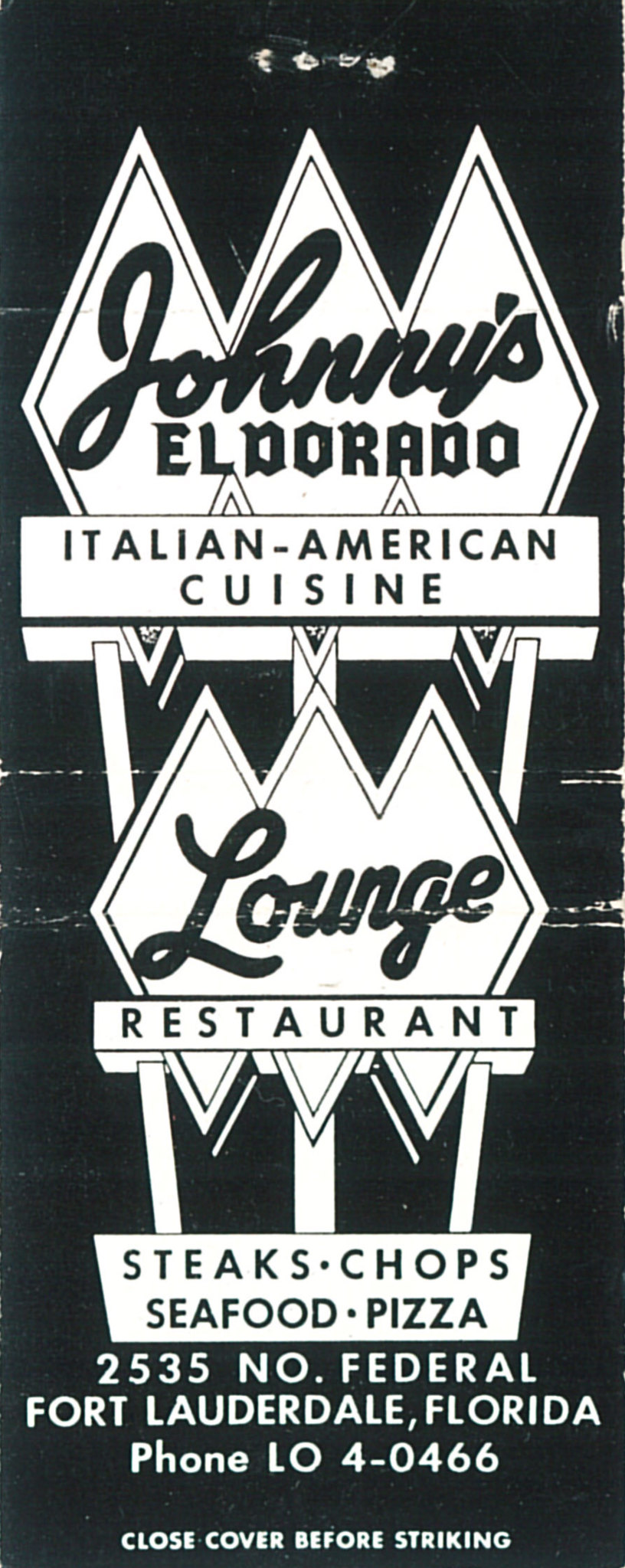
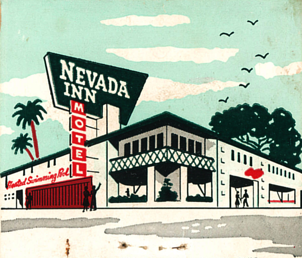
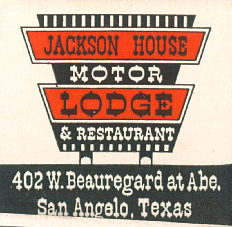
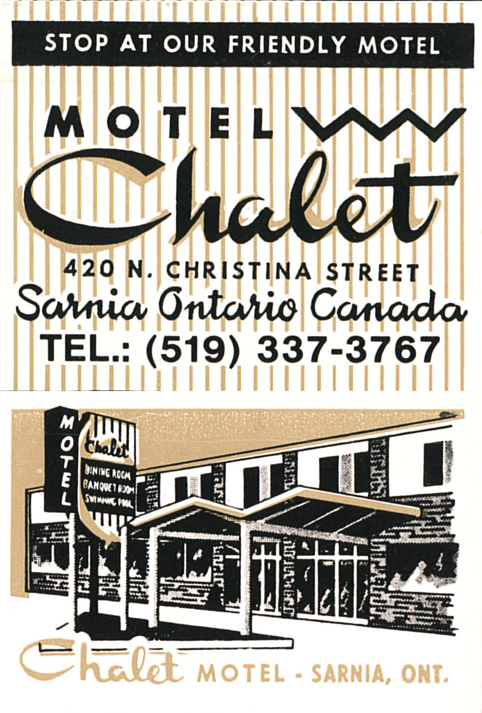
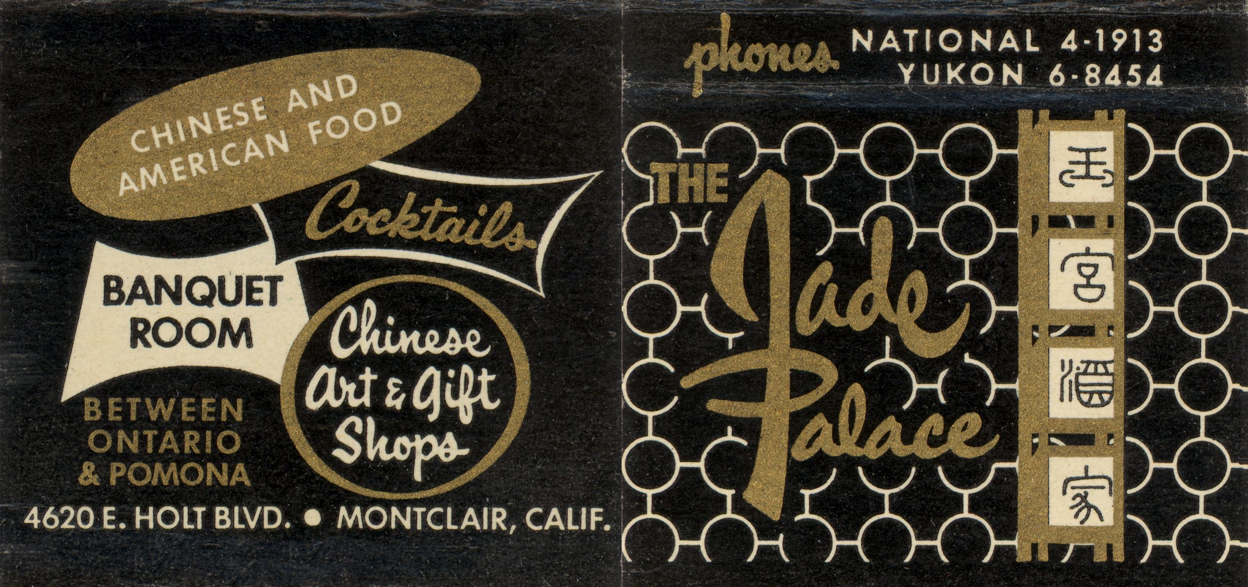
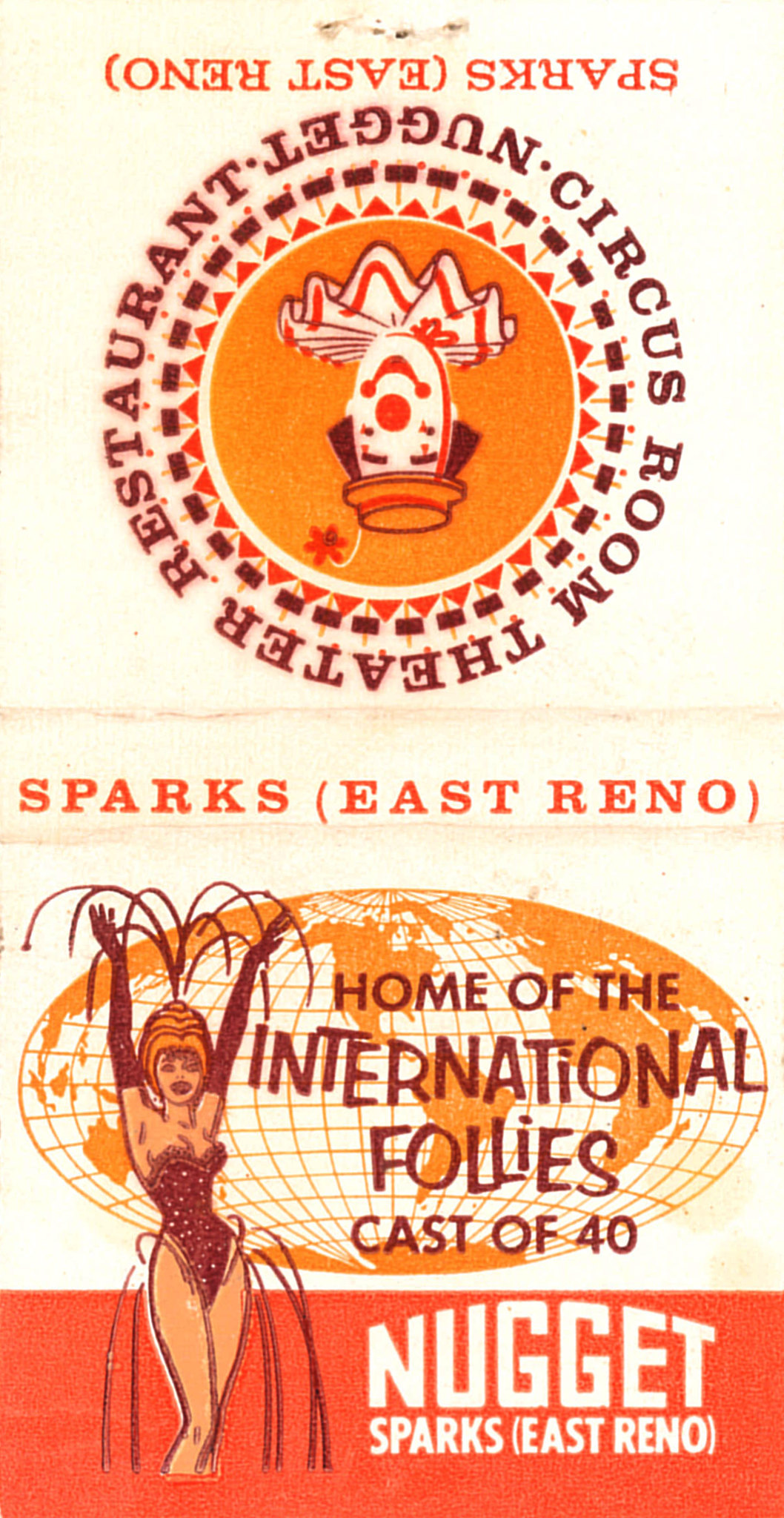
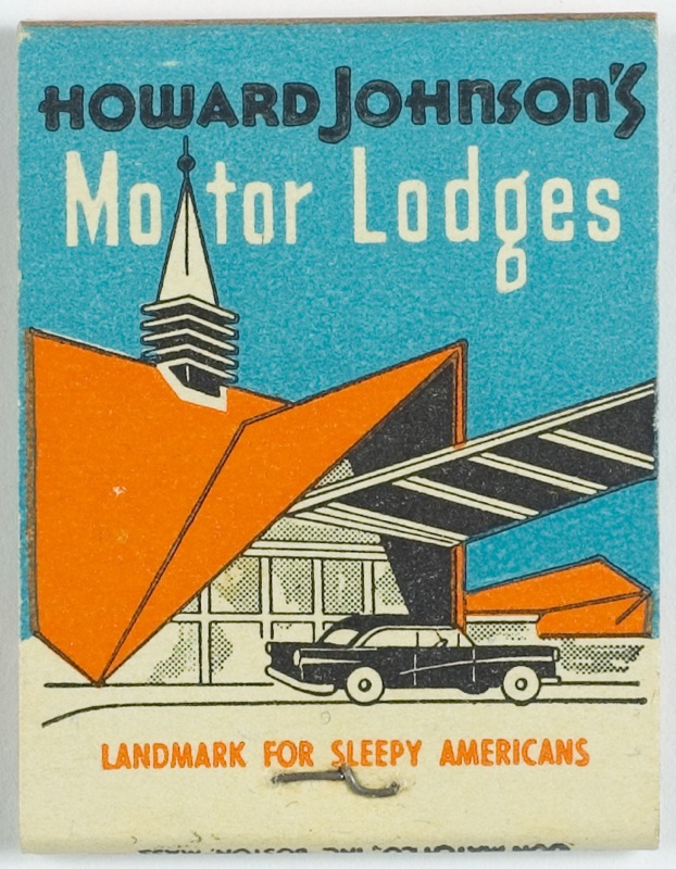
Yes, yet another matchbook post.
These things are just great little canvases for design opportunities. Think about it, you have a very small, limited area to work with and often a minimal number of colors. It’s a opportunity to really push your design skills.
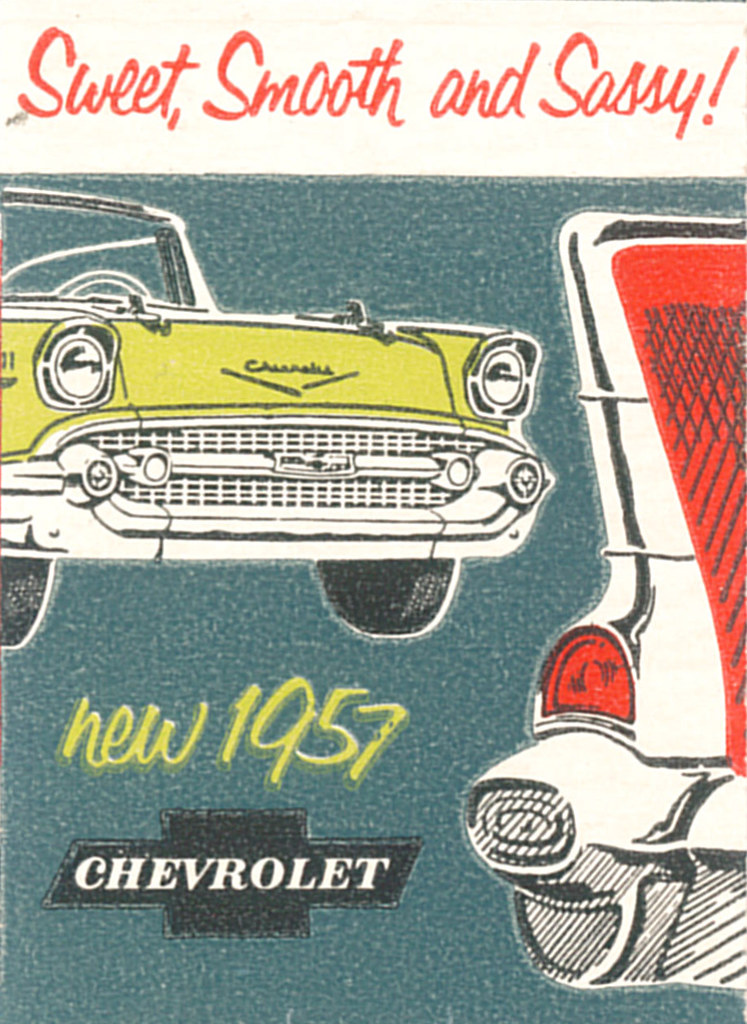
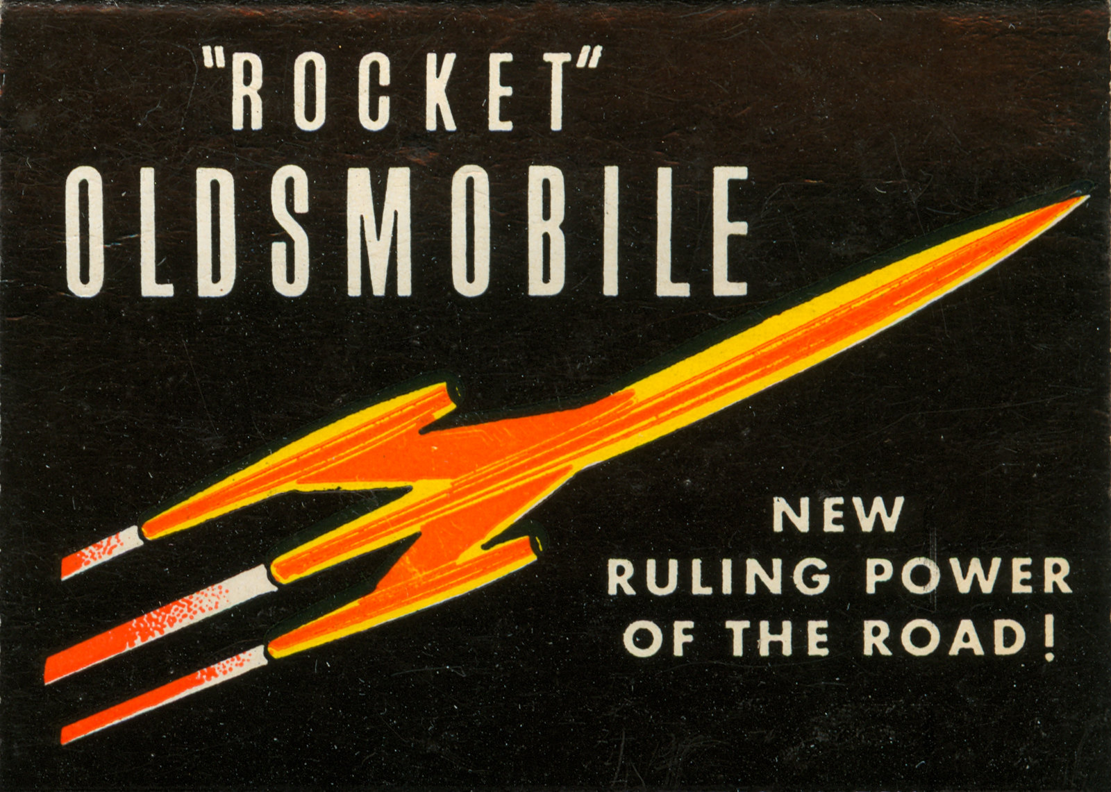
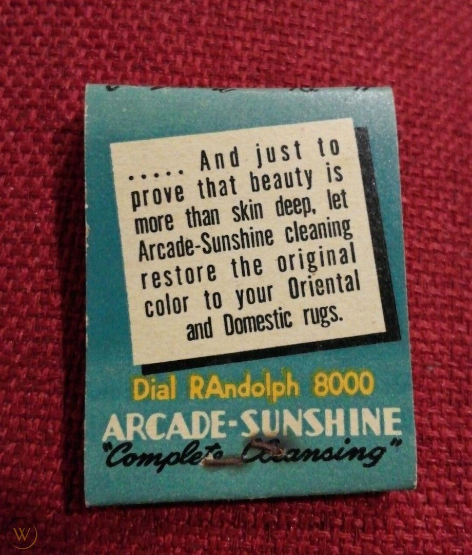
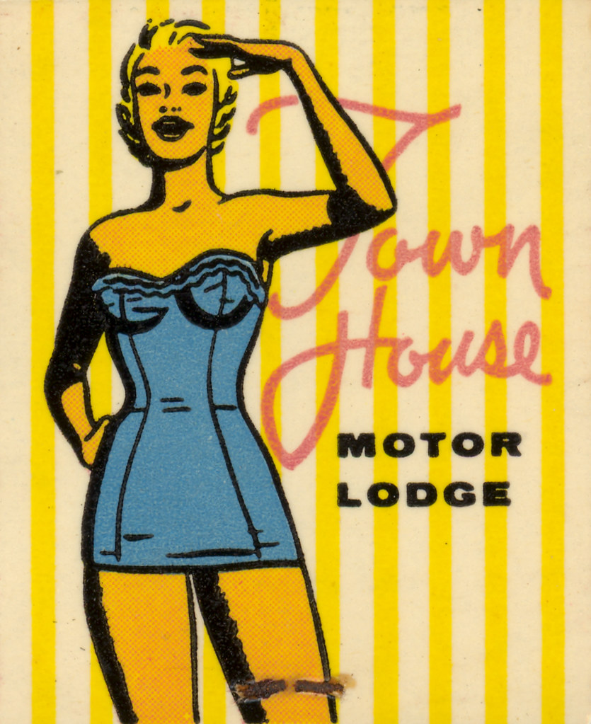
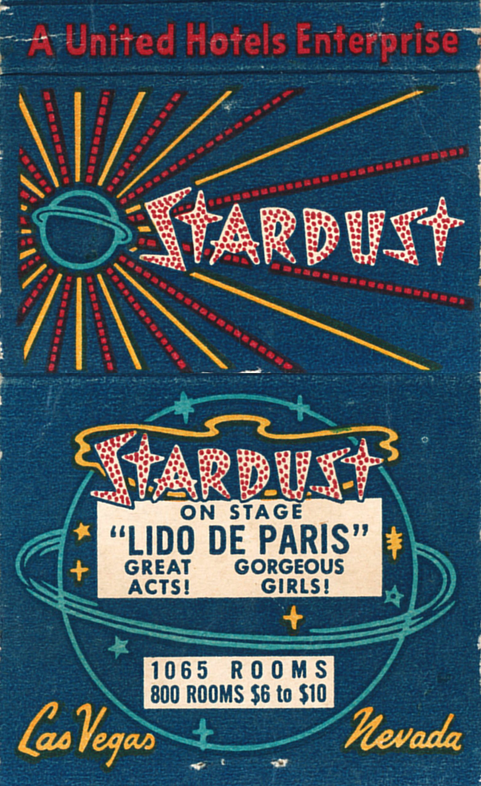
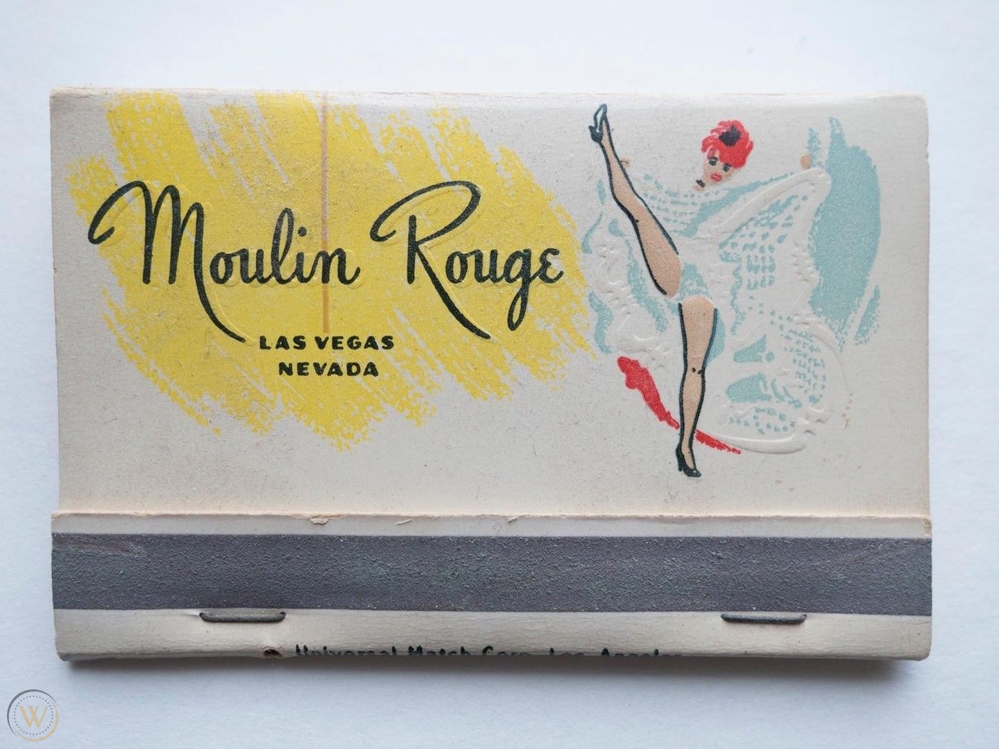
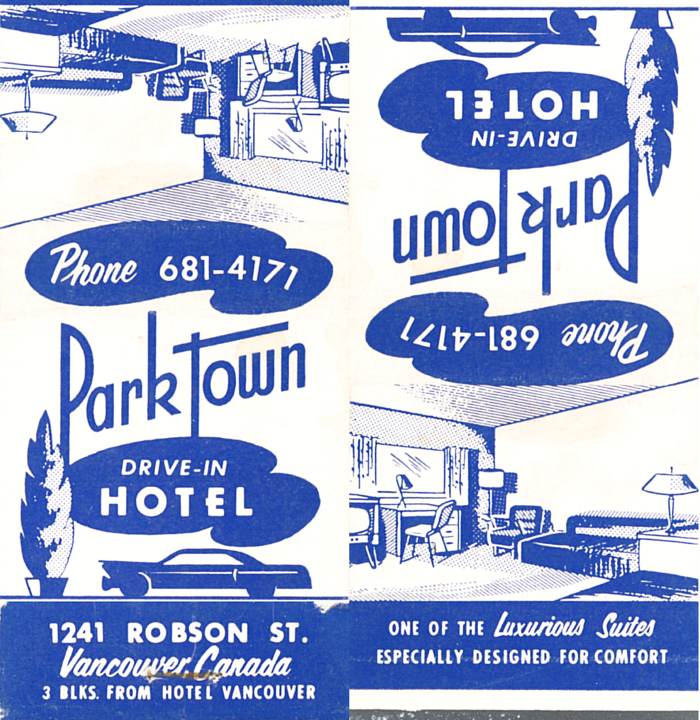
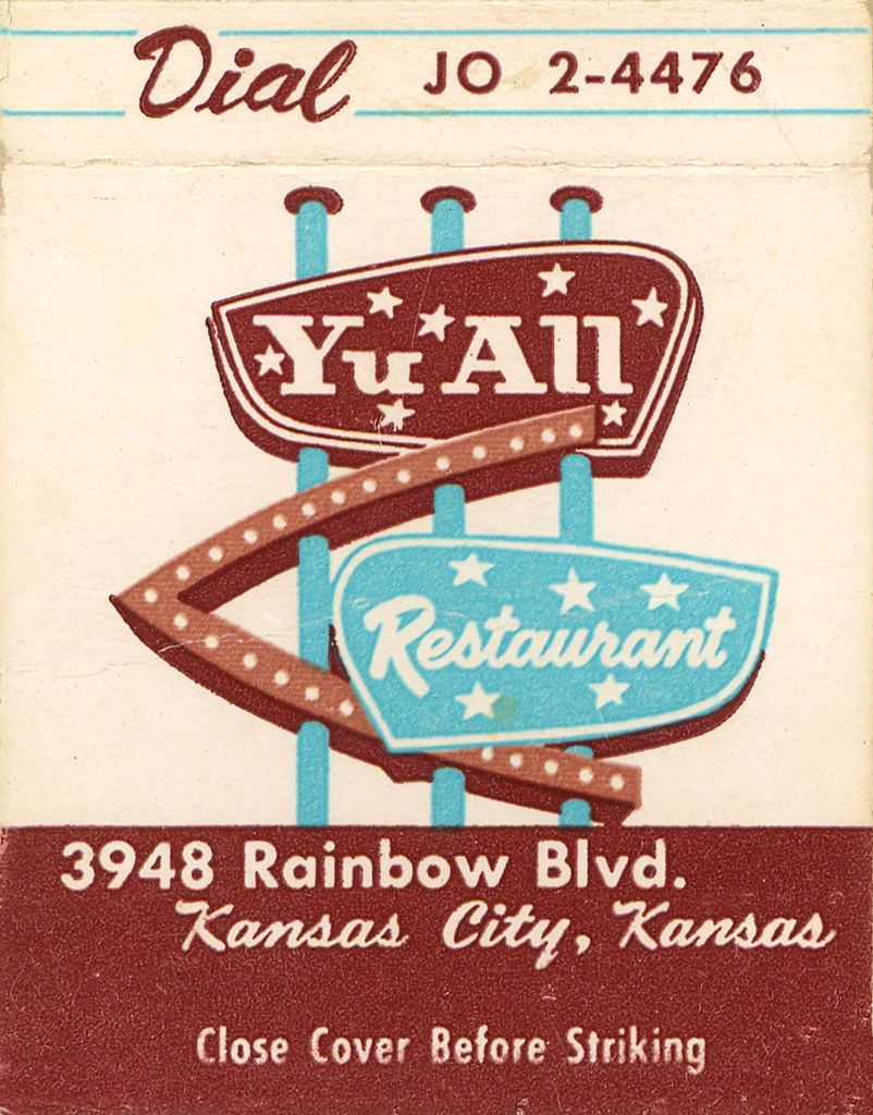
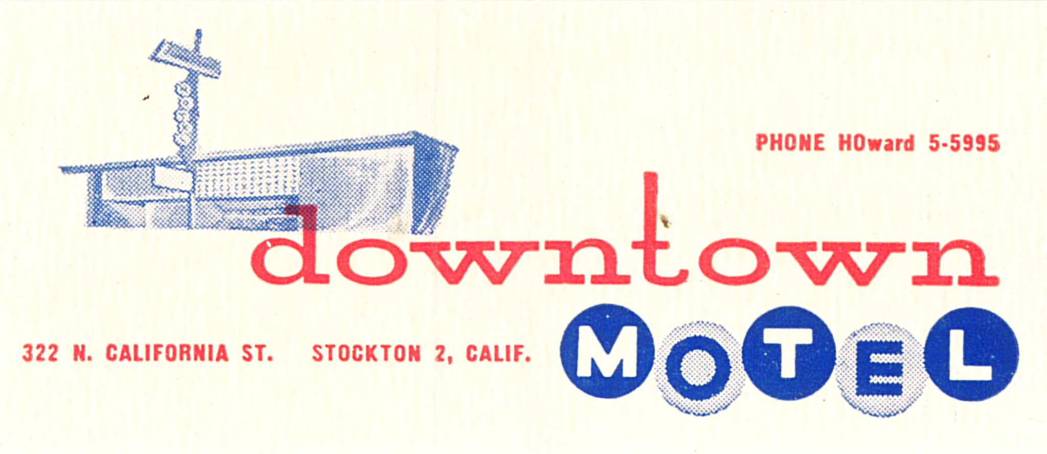
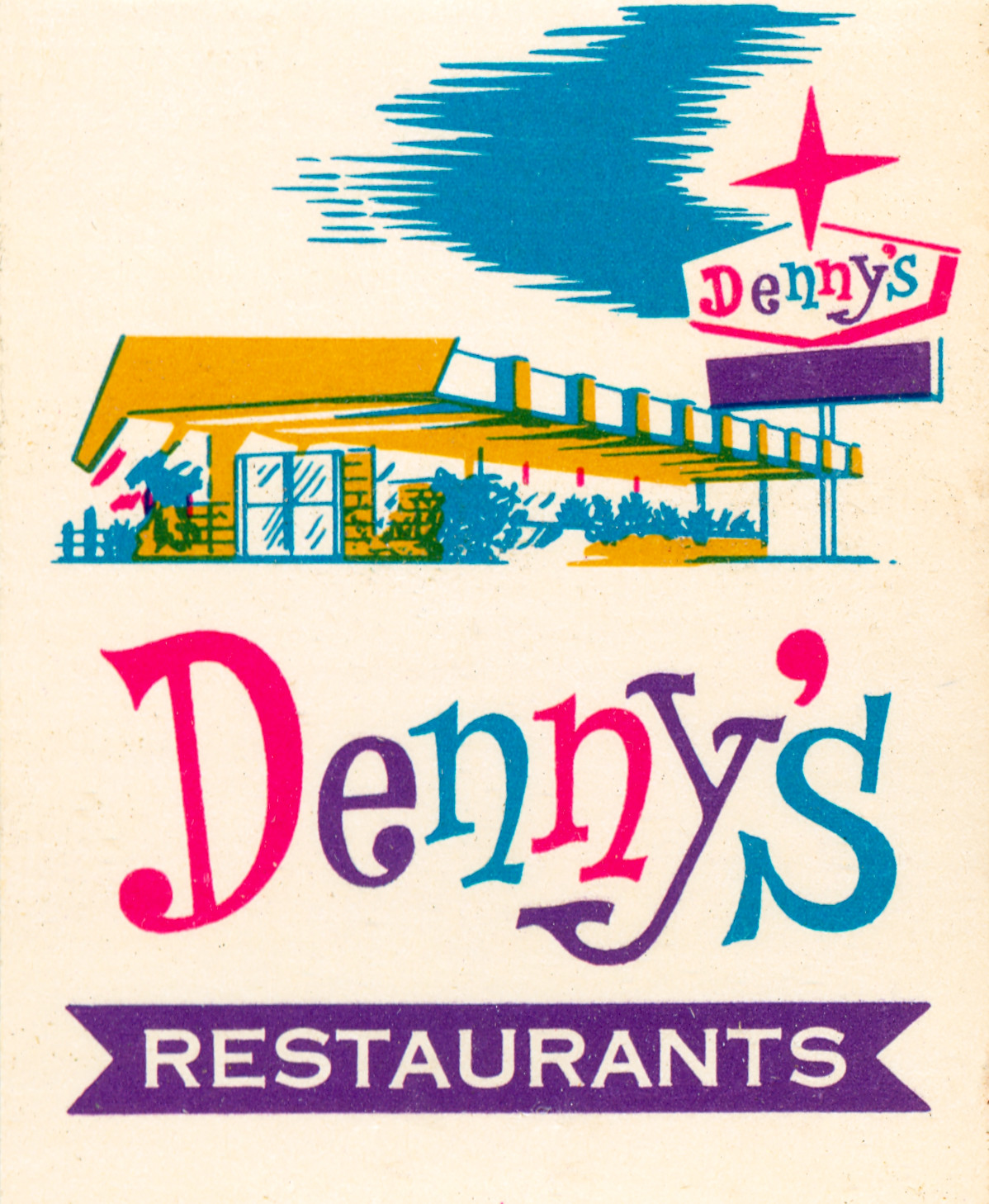
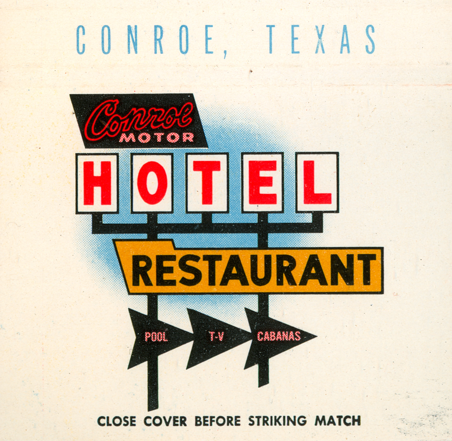
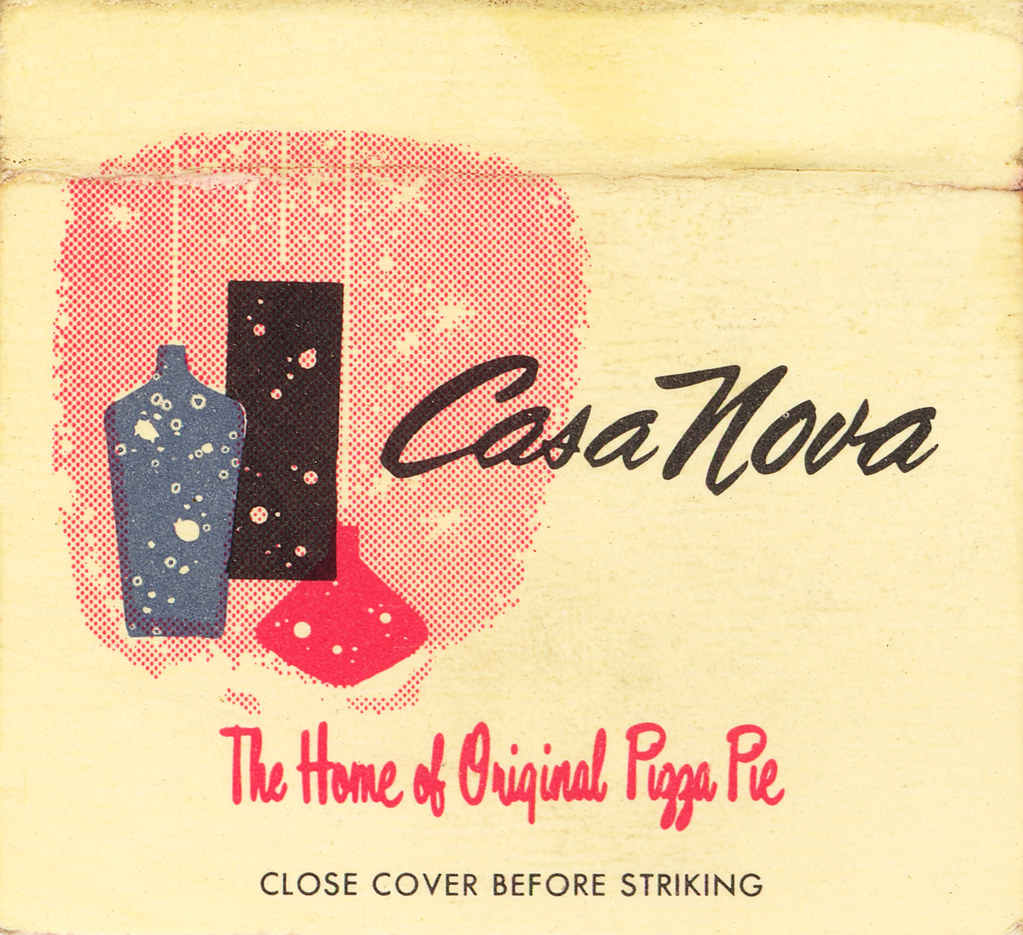
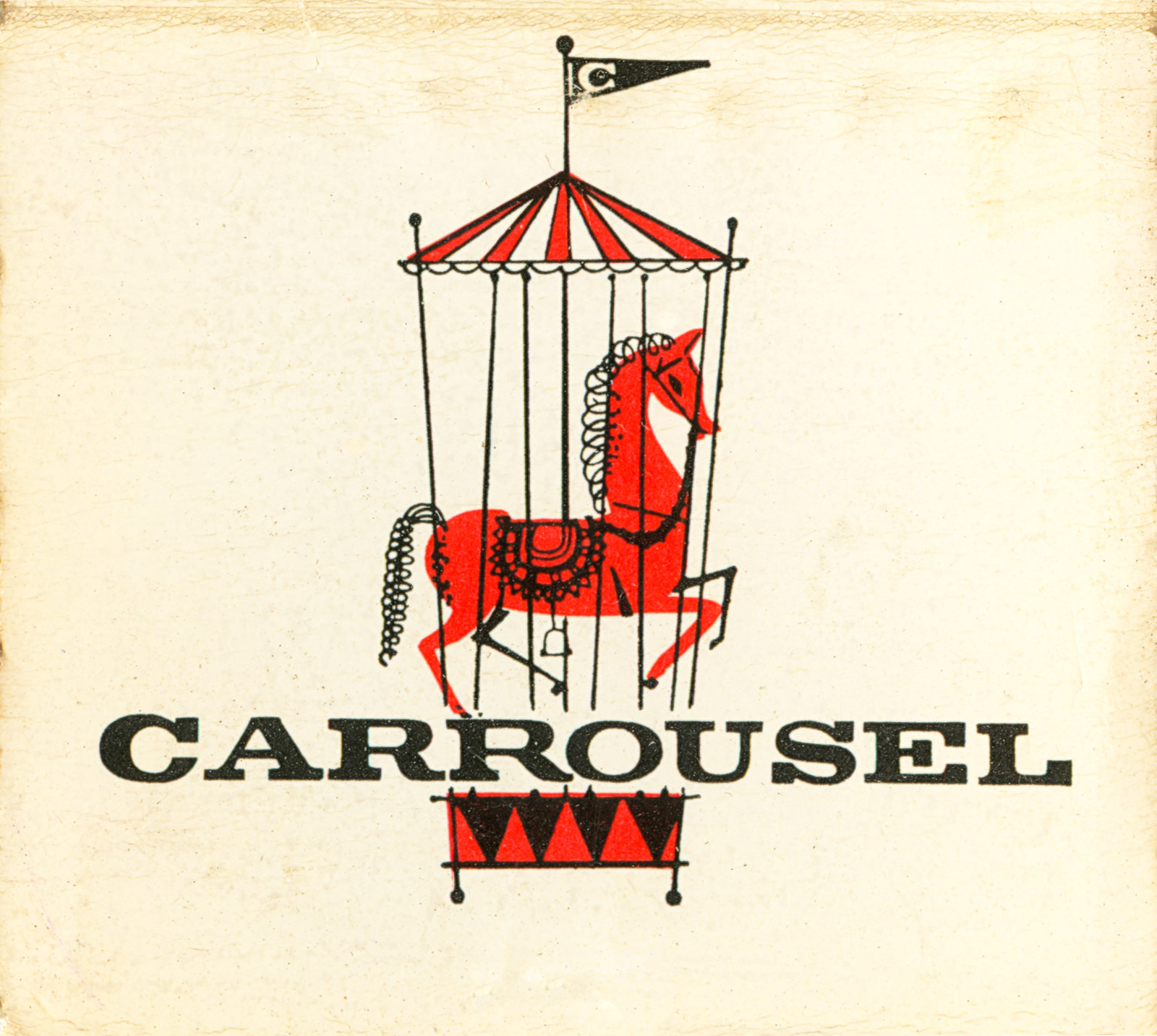
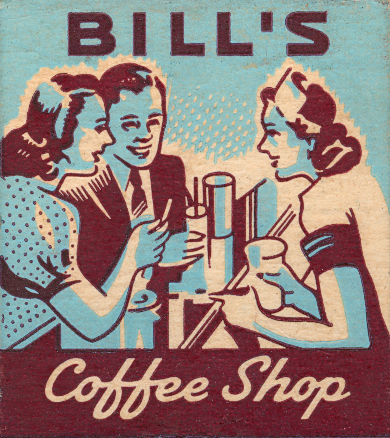
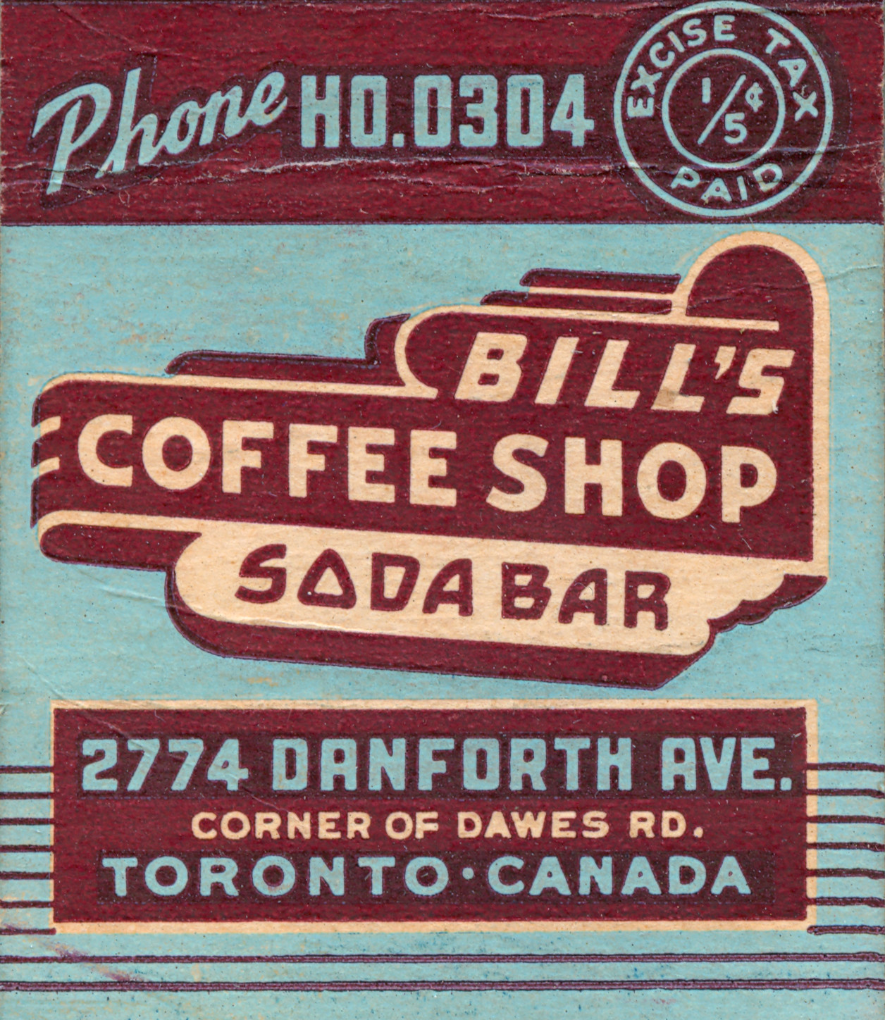
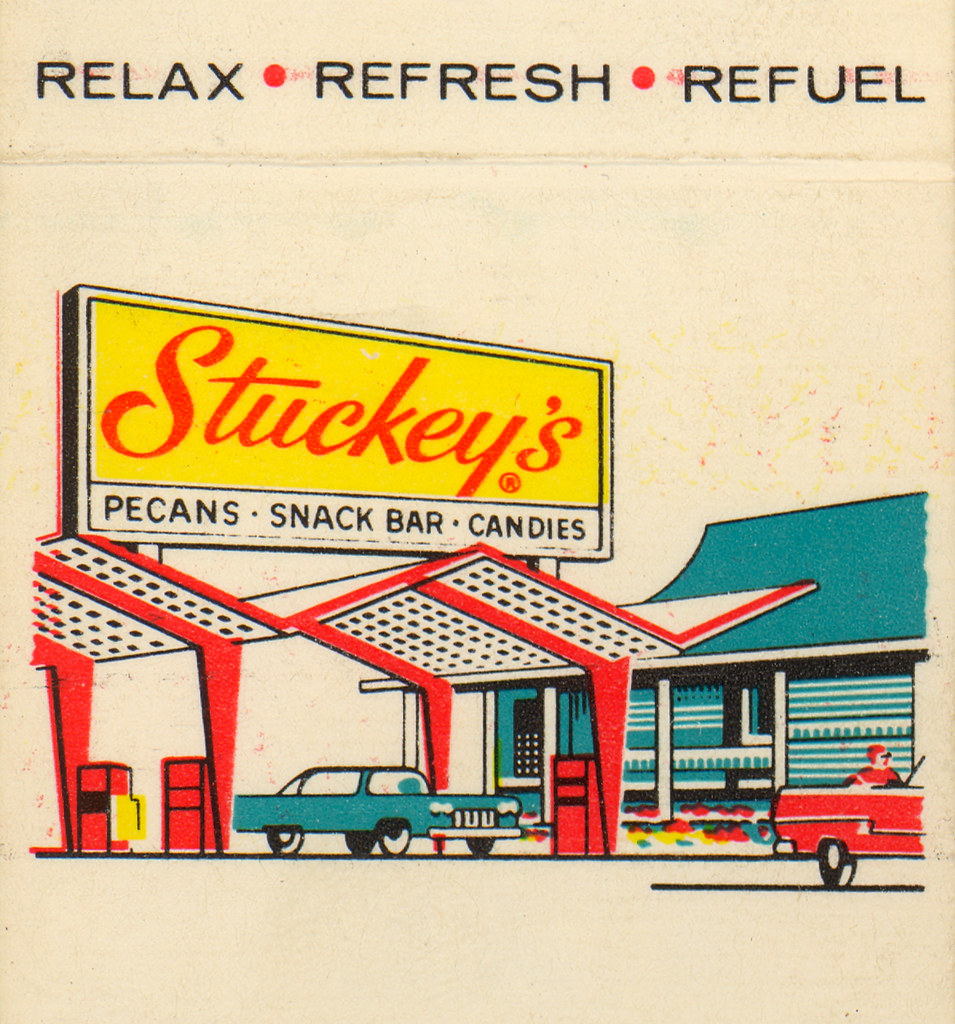
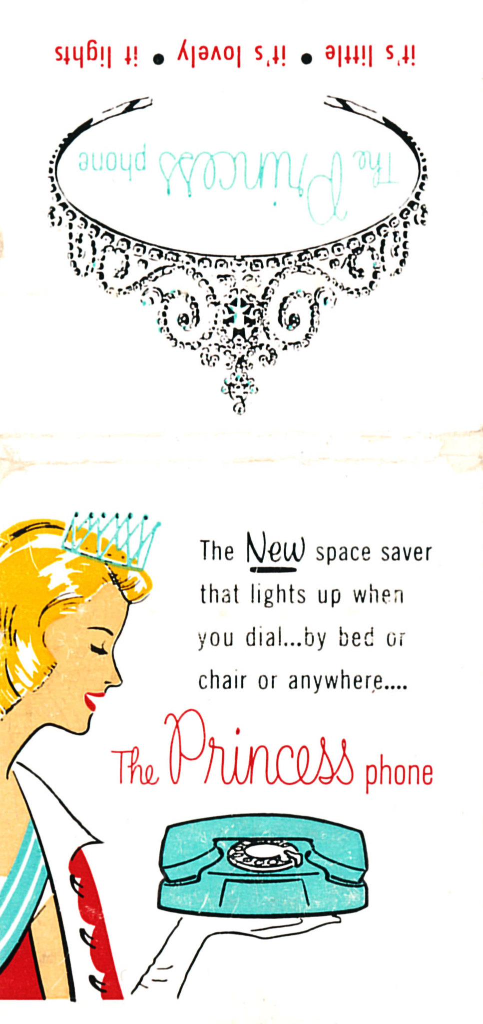
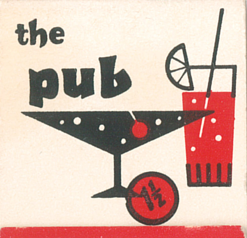
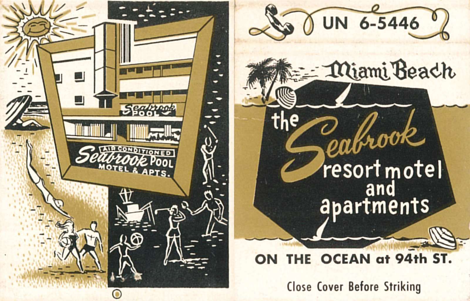
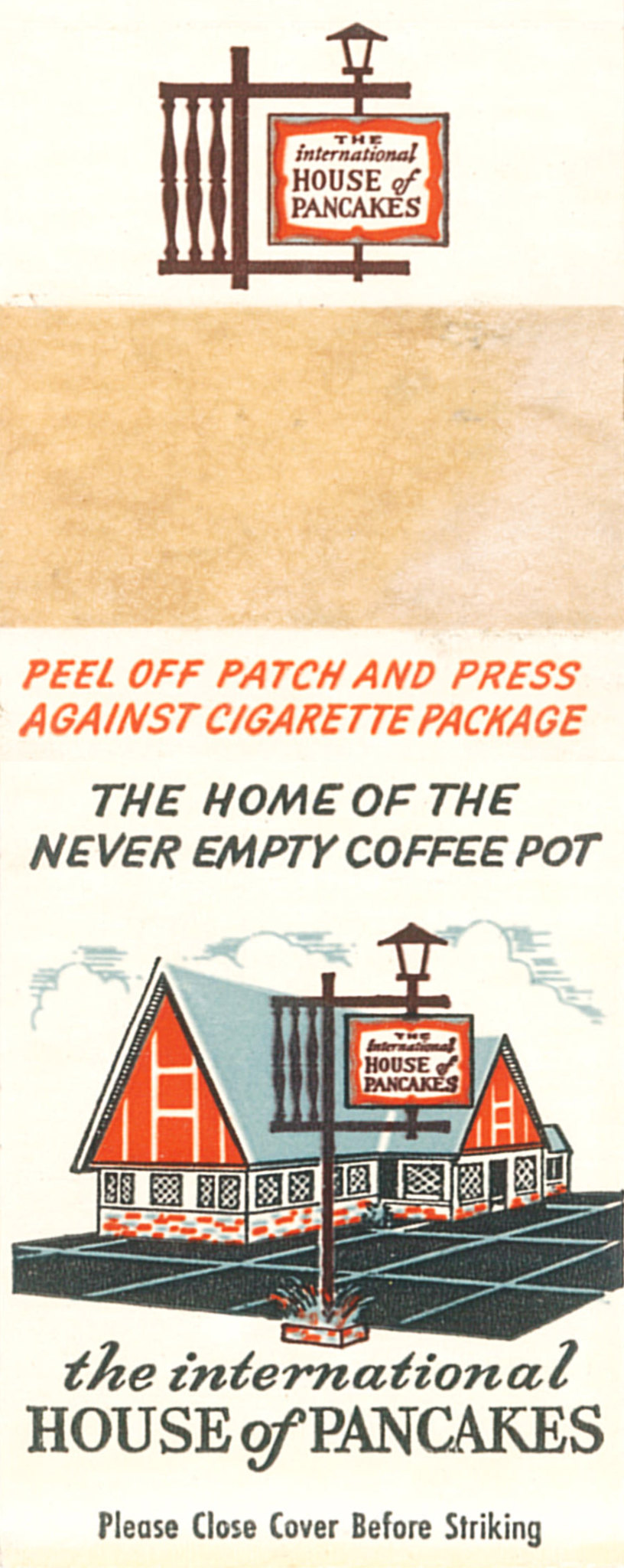
This time we’re looking at matchbook covers that just scream Mid-Century / Atomic design. Below are some great examples of line art, halftone, and the minimal design that was so popular during the 1950s / early 1960s.
For more matchbook covers check out our matchbook cover gallery!